L. DiCaprio will only date women under 25 years
L. DiCaprio dating history -- A visual

Some time ago, celebrity news broke that Leonardo DiCaprio and his much younger girlfriend, Camila Morrone, had broken up. America is having a cultural discussion about older men dating younger women. It is less a question about the legality of a man in his thirties or forties, as with DiCaprio, having a relationship with a woman in her very late teens or early twenties. It is more a question of the ethics of such a relationship. In the eyes of the law, an eighteen-year-old is undoubtedly eligible to participate fully in all aspects of society (enrolling in the military, voting, etc.). However, a man of DiCaprio’s stature, and given his wealth and fame, is likely to hold a certain sway over a much younger person, and collectively we are wondering if
DiCaprio also stands out when it comes to the challenge of talking about this particular social issue. It’s because he embodies all the problematic elements that spark public discourse. He’s an incredibly famous actor with immense wealth. As a consequence of his wealth and fame, we have been privy to aspects of his romantic life for a couple of decades now. And as he aged throughout this period, his romantic prospects generally remained within a particular age bracket. So much, so that gossip mills speculate that DiCaprio has some age cut-off.
At some point in the discourse about this famed actor’s love life, a graphic appeared (see below) on the internet that lent some credibility to the gossip mills. It is a beautiful graphic, and I have long thought about how to duplicate it. It was initially posted to the sub-Reddit r/DataisBeautiful by the user u/TrustLittleBrother, in 2019 when DiCaprio broke up with a previous partner. It was then updated in 2022. The below graphic is the 2019 version.
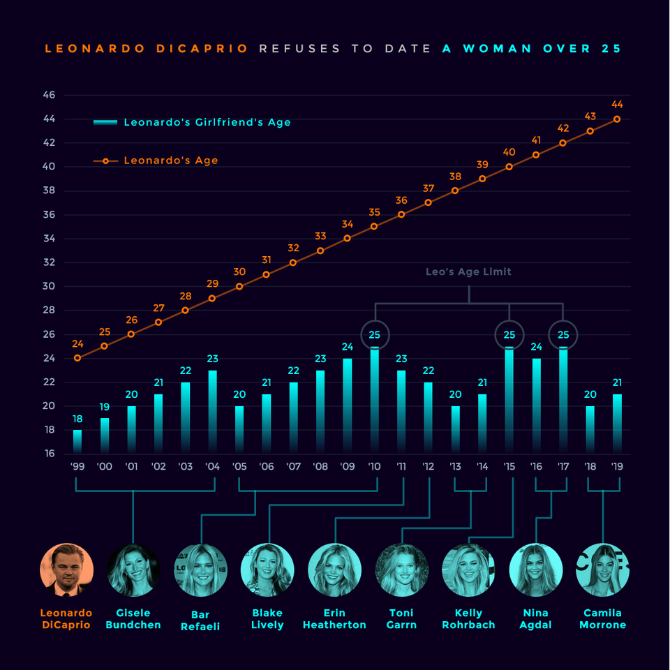
r/DataisBeautiful requests posters provide citations, and the creator did, citing several celebrity gossip magazines as their data source and MS Excel as the tool used to create the visual. It is a very well-crafted visual, blending data, a good eye for color and font, and a straightforward conclusion.
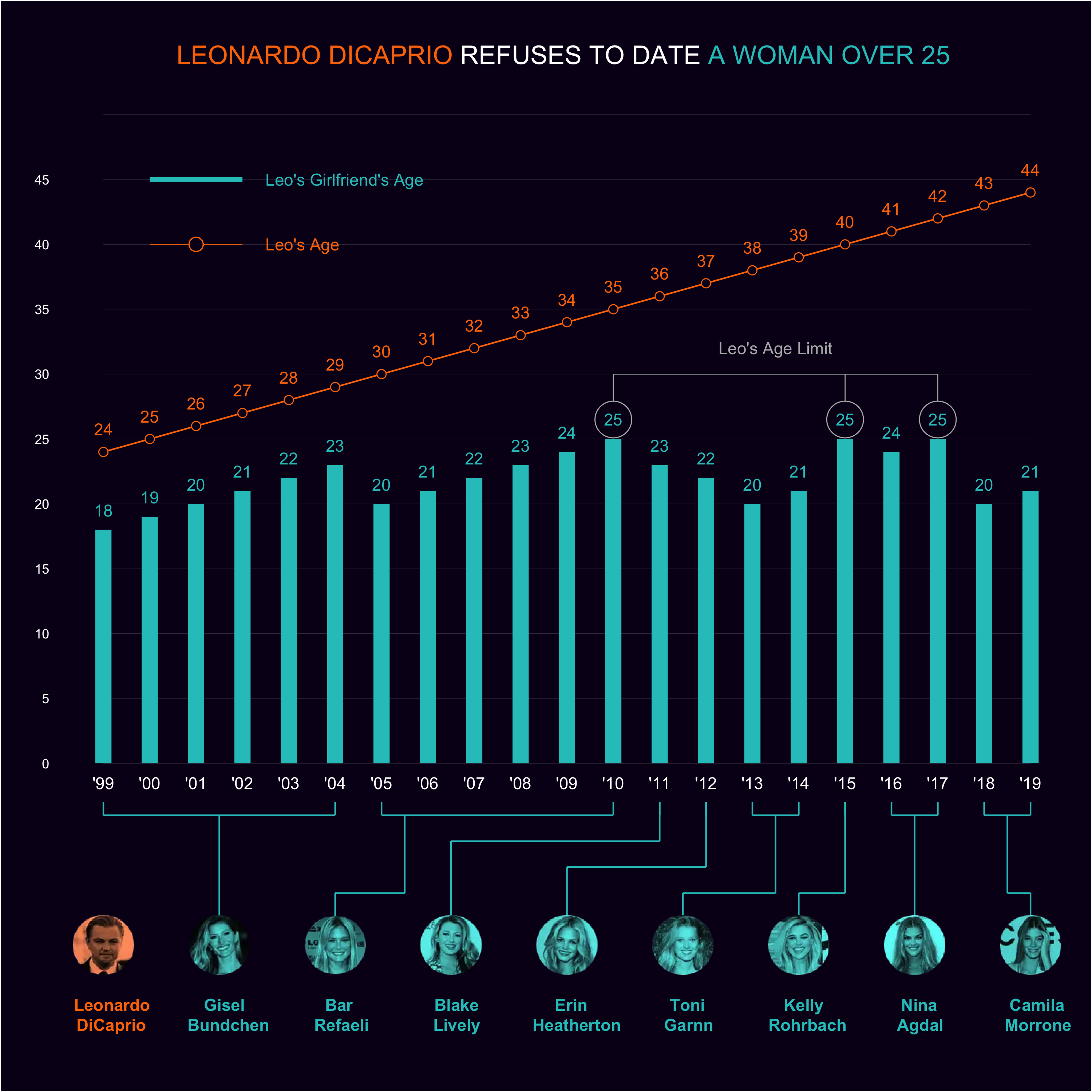
Over the years, others have tried to recreate it to varying levels of success. But recently, I have sought to recreate it using some of the tools in R I know (e.g., ggplot2). I’d not had much success, and then I came across the tutorial from Tanya Shapiro (i.e., tashapiro on Github), who produced the best approximation I had come across. I was finally able to create the visual of DiCaprio’s inability to have a romantic relationship with someone over the age of twenty-five years.
I owe many, many thanks to Tanya Shapiro for the tutorial. It came out well. Below is a side-by-side comparison. The color palette I chose could be more accurate, it is slightly off. No matter, those kinds of nitty-gritty issues can be challenging to mimic if you don’t have the original creator’s notes. Additionally, the fonts I chose are not the font used by the original creator. Open-source packages like ggplot2, ggimage, and ggthemes are fantastic and possess great versatility. I suspect the creator used a font like Gotham, which may be under license for MS Excel. The best approximation I could find was Montserrat. A great thanks to Tanya Shapiro again for her guidance.
There are some finer points, such as the bars having a color gradient, as opposed to being solid. I need to look into being able to do that. I am sure it can be done.

|
|
(Code for placing images side by side using Flex Boxes came from Jei Wang – http://jiewang.name/posts/2020/03/images/)
Comparing the images using a carousel


Reference
Shapiro T. Personal Data Visualization Projects [Internet]. 2022 [cited 2022 Nov 11]. Available from: https://github.com/tashapiro/tanya-data-viz/blob/62d771bd4713fd6090f91b1e6893f08760ffce3f/dicaprio-gfs/dicaprio-gfs.R
Title Image– Christopher William Adach from London, UK, CC BY-SA 2.0