Our World in Data Energy (TidyTuesday Week 23)
TidyTuesday Week 23
Our World in Energy
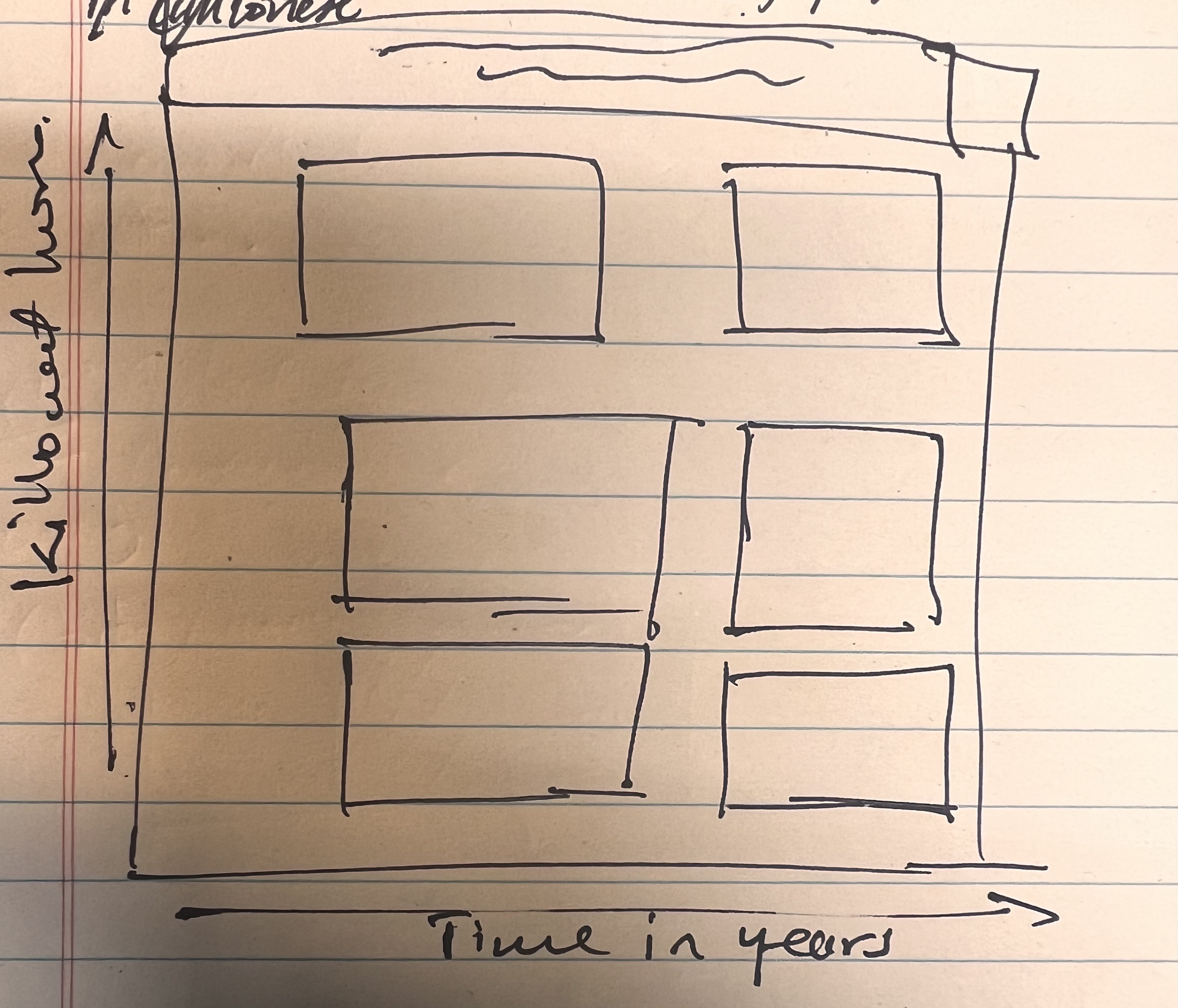
For this week, I wanted to try my hands at creating a visual document, and not just one chart. I wanted to put together a single document that displayed a collection of charts, such that the individual document would tell a story. Think in a similar manner to what you see on dashboards, but with static images. Interactivity is sometimes overrated, given that you have to click around all over the place. Before you do start, be sure to sketch out what you want. Just give you a rough idea of what you want your final output to look like. I am going for something that looks like the below.
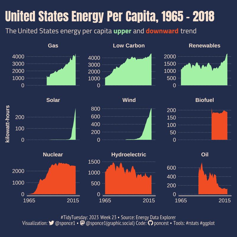
I want to thank Steven Ponce for the code guidance and the inspiration. The visual document he created of US energy consumption was similar to what I had in mind (see below). Very nice work.
Libraries
See code.
Set Up Canvas
I found a nifty little feature in R, where you can set up the canvas that will hold the chart or visual document. Additionally you can record various iterations of your project, that way you look through the progress. This comes via the camcorder package and the gg_record(). With the gg_record() function, you set up the dimensions of the visual chart or document (breadth, width etc.), the format (e.g., png, pdf, jpeg etc.), the directory where it is stored (the here() function comes in handy at this point), and set the resolution of the image in dpi.
See code.
Load Data
Once we have our canvas set up, we can then read in our data. This week for TidyTuesday we are using the Our World In Data (OWID) Energy data. Lots of different ways to access the tidytuesday data. The tidytuesdayR package and its tt_load() function is a good way of accessing the data object via an API. You can then access the specific dataframe from the object via its name. Don’t forget to save it. I typically prefer to save them as csv files (i.e., comma-separated), as they are lightweight and readable in many programs. Take note that I use the clean_names() function to read in stored data. This function via the janitor package ensures that the resulting names are unique and consist only of the characters, numbers, and letters. Capitalization preferences may be specified using the case parameter.
The owid_energy dataframe contains 129 variables and 21890 observations.
See code.
Examine the Data
It is a good idea to examine a dataframe (i.e., data set) when unfamiliar with the data. There are a few functions from the dplyr and base R you can use for this process. The glimpse() from dplyr is similar to the describe command in Stata. However, it provides a transposed version of the data with columns running down the page, and data runs across. It’s a good way to see all the columns at a go.
The str() function or structure function, provides a similar approach to glimpse(). But it provides detail in a different way perhaps in a more readable manner. I also use the view() function, which will display the data in a spreadsheet format, like you would get with Excel or GoogleSheets. The head() from the utils package from base R is also a good option, but it only will show the first five observations and will typically truncate the list of variables. However, the function colnames() will show the list of the columns.
The range() function from base R will show you the min and max values of a particular variable.
See code.
Here is what I notice with the data given the above commands (note that they create data objects which you can then view):
-
With the above we first see that our data is arranged in the wide format (i.e., values do not repeat in the first column). To effectively create plots, particularly for multiple years, I will need to pivot the data longer (i.e., repeat observations by year).
-
There is a lot of data here, for all the countries in the world and for multiple years. The
range()for the year variable shows that we have data points from 1900 to 2022. Similarly, the inspection of the unique values of the iso_code shows that there are 219 unique codes (i.e., 219 countries and territories). The iso-code[^1] is a unique code that represents each unique country or territory.
Data Wrangling
The objective here is to create a subsample of the data for analysis. As I noted, the dataset is pretty big. If you look at the Our World in Data website, their dataset contains information from multiple years, multiple countries, and even contains aggregates by year. Furthermore, there are many variables pertaining to electricity consumption and electricity consumption per capita based on the raw material used to consume electricity (e.g., coal, wind, hydro-electric).
You can certainly create a visualization for all of that data (interactive choropleth maps may be one way to achieve this), but I want to keep things a bit simple. I have chosen to focus on China (iso-code: CHN). I have been a bit fascinated with China of late, so let’s do that. Furthermore, I am interested in the per capita production of electricity by source.
Electricity consumption typically is measured in terms of kilowatt-hours. We use the select() from dplyr to pick specific variables we want for our visual document which are all the variables from country to gdp inclusive and all the variables that end with the string “elec_per_capita” (we employ the “helper” function ends_with()).
Then we pivot our table longer to make it easier to plot the data. If you work with Tableau you will know that this is the format Tableau prefers when using data to create visual representations. For our purposes, we want the data only in the columns showing electricity generated per capita while keeping all the other variables (country, year, iso_code, population, gdp) constant. To pivot data we use the pivot_longer() function from dplyr.
Then because the variable names created are long and cumbersome for instance, “hydro_elec_per_capita.” We can create another variable that will describe the type of energy used to produce the data. For example, the type hydroelectric will correspond to the hydro_elec_per_capita value under energy. We do this using the mutate() function in combination with the case_when() function.
We also employ the as_factor() within the mutate() function to ensure that the type variable is a factor, that is it is categorical (i.e., ten categories). In Stata you would see these listed as 1 through 10 if you were using the tabulate function. Furthermore, we can order the factor levels using the function fct_relevel().
Now we create a variable that will contain a note to be used in the overall theme of the visual document. The document created by Ponce, shows time in years on the x-axis and kilowatt hours on the y-axis. In addition, that fact they make use of two colors. One color (i.e., green) shows increases in the kilowatt hours of electricity consumption per capita over time. While decreases in the kilowatt hours of electricity production per capita over time are shown by the color red. To make theming our visual document in this manner it is easier to create a variable that denotes these colors, which can be read into the ggplot aesthetic layer. So essentially, you define the variable, then you define the colors as a separate object later on. You then tell ggplot, what to color by.
Another great tool in the Tidyverse suite is the pipe operator (%>%), which may be used to chain various functions. Great for data wrangling and when working with a data file requiring a lot of changes.
See code.
Plot Aesthetics
This mainly has to do with the color and background of the plot. And the text used on the plot. I like to go with a light background contrasted with dark lettering. Others prefer to go with a dark background with light lettering. It is up to you.
-
There is a nice muted yellow/cream combinaiton that I have beceom fond of for background it is defiend by the HEX
#FDFAF1. The good thing about this color is that it contrasts with many other colors that may be layered on top of it, in the same way that a white might, but not as boring. -
For lettering black or dark gray will do just fine. Of late I have been using a glossy black for my work, defined by the HEX
#252324. -
If you will recall we defined a highlight variable with the categories of “up”. We will need to define those colors. We have to be cognizant of how those colors would look when contrasted with the yellowish background and we have to cognizant of possible colorblindness in those. reading our visual document. Colors suggested for people dealing with color blindness are Blues and Reds based on the web tool ColorBrewer.[@2003Brewer-cb][^2] I will go with Blue (HEX -#2C7BB6) for up and Red (HEX - #D7191C) for “down”.
See code.
Defining the Font
Note that we are using the Font Awesome version 6.4.0.[^3] Font Awesome is a package of fonts, icons, and emojis that you can use in HTML and markdown documents. It includes various symbols, icons, such as those used for social media and websits (thumbs up, smilely faces, twitter icon, instagram logo etc.). I want to have a little caption at the bottom of the data visualization document that has my contact information.
To be able to include those, you need to download the FontAwesome fonts. Once that is done, you can then call them into your code using font_add() function from the systemfonts package (It is automatically downloaded when you add the showtext package. You will have to specify a name and the location of the fontawesoe font style (formated as an otf file).
See code.
Defining Titles and Captions
One of the great things about working in R with ggplot from the tidyverse is that you can define things like title and labels in objects and then simply call those objects into your chart when you create it as opposed to writing those out within the code of plot. It helps for a neater, less murky overall code. I am grateful to Steven Ponce, for providing a great working example to build off here. Below I use the str_glue() function. This particular function acts as a wrapper around the glue() and glue_data() function from the glue package. They provide a powerful and elegant syntax for interpolating strings with {}.
I then employ elements of HTML to add some additional caption information that will be included at the bottom of the chart, things like contact information. Take the following code:
tw <- str_glue("<span style='font-family:Rockwell'></span>")
It means that we are to create an object with a particular string (i.e., letters) pattern. Moreover, that string will have certain characteristics, including a font that is Rockwell. The string character itself is
See code.
Create the Plot
I am not going to walk through the use of the various functions within ggplot. I do just want to note the use of the facet_wrap() function which allows for the placement of multiple plots on the same document.
See code.
Conclusions
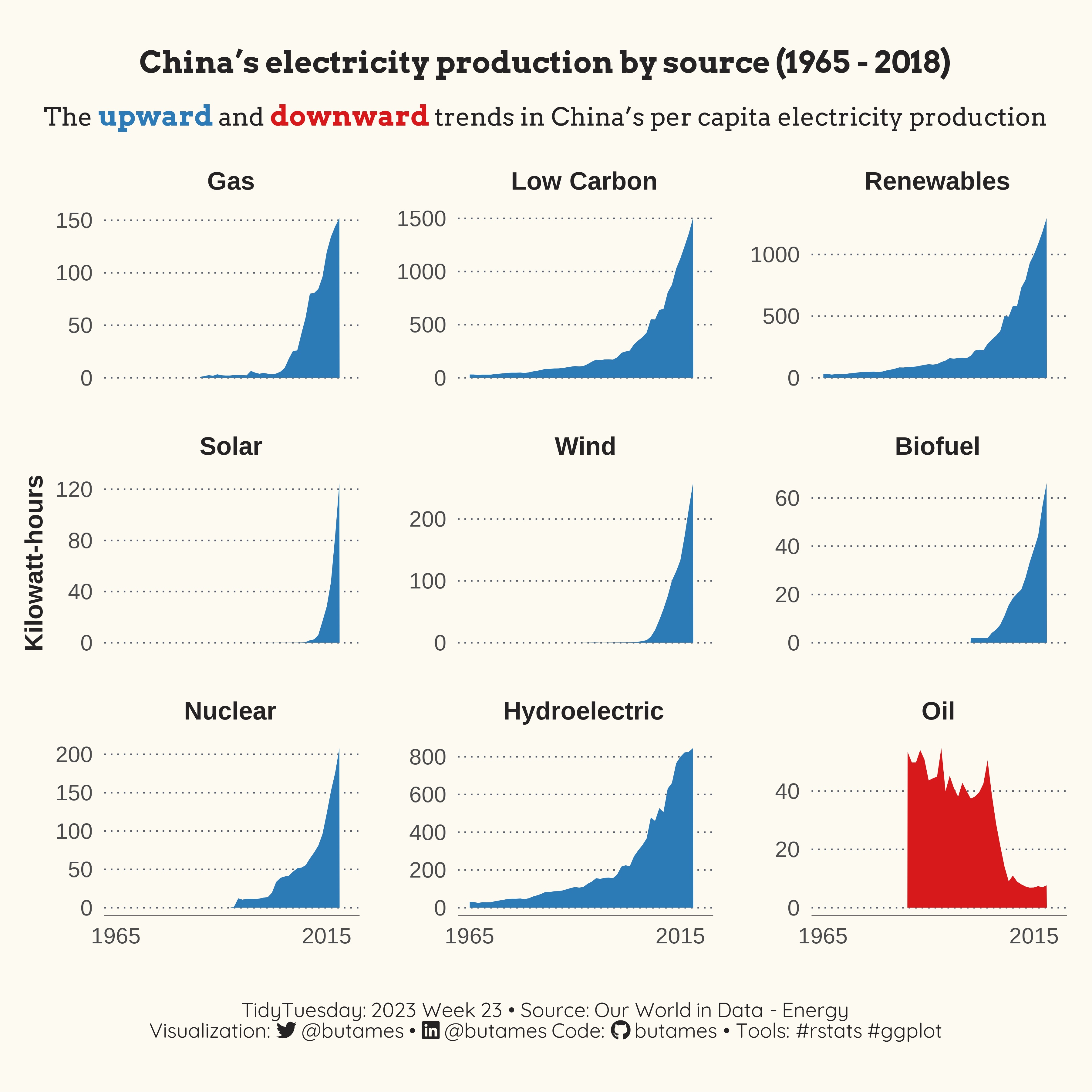
It came out rather nicely from what I can see. Over the course of nearly 6 decades, China experienced energy growth, in terms of per-capita kilowatt-hours. This growth appears to be exponential for all energy sources except Crude oil. This makes sense, during that time, China went from a large sovereign state experimenting with communism to an economic behemoth that manages to blend elements of capitalism and communism (at least the way Western propaganda plays it). Consequently, it makes sense for China to experience demand driven increases in energy generation. One surprising finding was the decline in Crude oil as a source, but again that makes quite a bit of sense. With the specter of climate change, an industrialized country like China must be working hard to do its part to curb greenhouse emissions. The reviled image of China makes it an easy target for critics from developed economies to focus their ire and point to China as a source for the problems related to climate. A reliance on renewables and a decrease in the use of oil, can help China create and preserve an image of being part of the international community that seeks to address the climate challenges. And then of course there are local health and wellness concerns. I vividly remember the hazy skyline that was shown repeatedly on TV in the lead up to the Beijing Olympics.